Environmentally conscious, radical riso printers in Leeds
Riso Printing
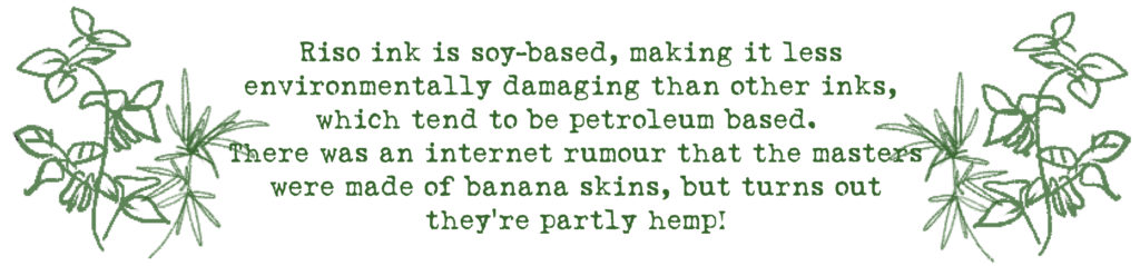
Riso printing has a special place in our hearts. It’s soy-based, kinda lo-fi and gorgeous.
On this page
What is riso printing?
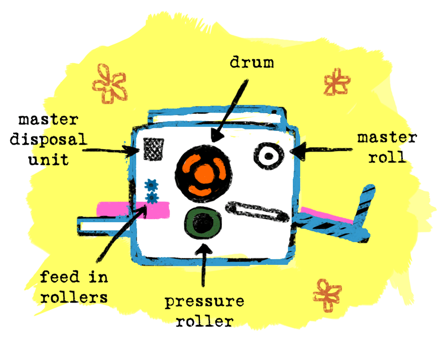
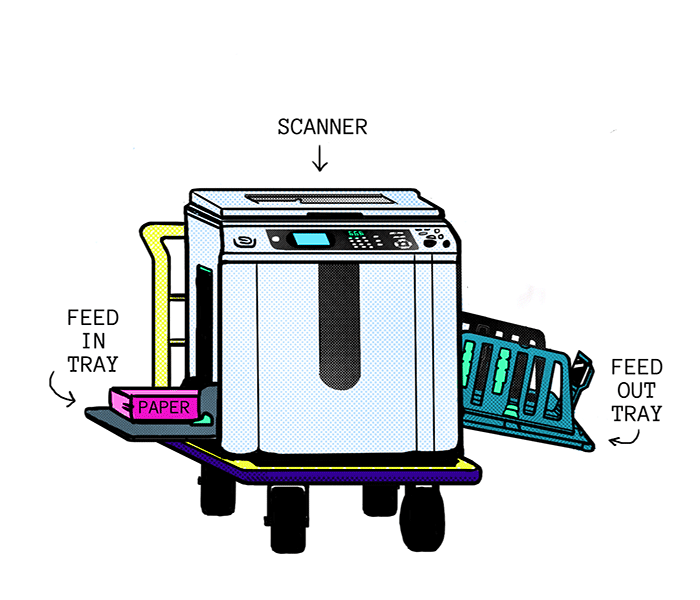
Riso printing works along the same basic principles as screen printing, although digitized and automated. The computer (or scanner unit on top) describes the image to the risograph in binary code, telling it to create millions of tiny holes into a thin filmy sheet, called a ‘master’. The master is then wrapped around the drum. When the drum spins, the ink is forced out through these little holes, transferring the image onto the paper as it passes by.
Different coloured inks are printed in layers. The paper is fed through the one-colour machine (pictured) once for each colour and for each side.
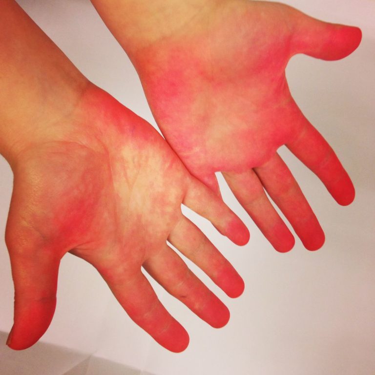
Riso ink is wet. This means that for best results, the paper should be allowed to rest between each pass through the printer, especially for work with heavy coverage (large areas of colour). The ink is oil based, and never truly dries, so if your zine cover is totally riso printed, expect slightly inky fingers after handling!
(a footprinter's hands after handling several hundred zines with pink riso covers)
Please consider this when designing your artwork, as heavy coverage can result in:
printer jams
set off (ink transferring on to the wrong side of the page)
roller marks
smudging
pooling and/or patchy ink coverage
otherwise compromised quality.
Wet ink also means that the paper is prone to expand slightly. This, together with the inevitable slight variation of sheets of paper being pulled through machinery by rollers, means that registration between layers can vary by a couple of millimeters in any direction. As this happens in each layer, you can end up with copies where one colour has moved 1mm left and the other 1mm right, creating a 2mm mismatch (or more!). We print slowly and carefully on jobs that need careful registration, which will add a little more to your quote.
Designs which take this into account work much better than those which expect pinpoint precision. Increasing the width of borders and overlapping graphics can help ensure there are no visible gaps.
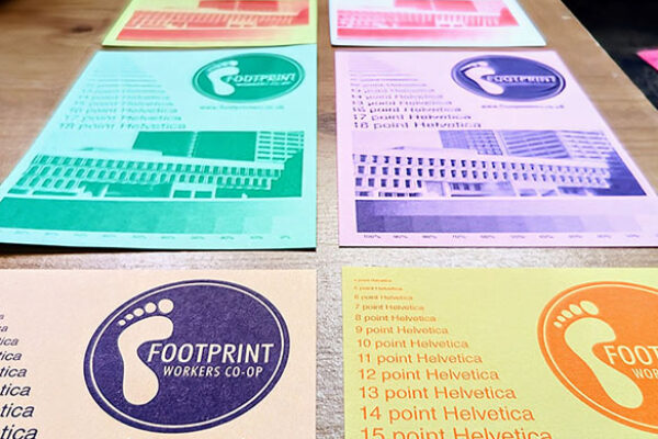
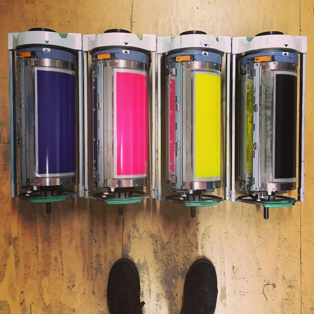
What colour inks have we got?
We have:
Black, Bright Red, Orange, Yellow, Green, Blue, Purple, Fluorescent Pink, Metallic Gold plus our most recent addition, TEAL <3
Black is the cheapest riso ink, the regular colour inks are twice as expensive as black, and the metallic gold is more expensive still.
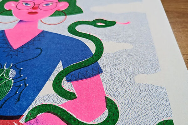
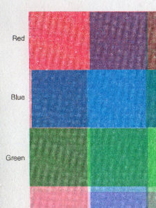
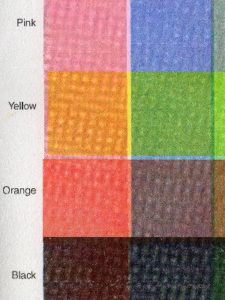
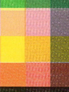
Layering riso colours is an art in itself. The inks are translucent, so what paper you choose to print on, and how you decide to layer the colours will effect the final result. Layering colours at less than 100% opacity will usually result in more effective colour mixes than going with full opacity.
There are loads of artists out there doing exciting things with colour layering. If you’re looking for inspiration, searching the hashtag #riso is always going to bring up exciting colourway examples. Here are a few samples of colour mixes:
GOLD
Our Metallic Gold ink works best on dark paper stock. So far we’ve printed on Context Slate (a lovely deep grey), Context Deep Blue (which looks very luxurious with gold print), and most recently Shiro Black. This is a lovely dark near-black card which the gold looks gorgeous on.
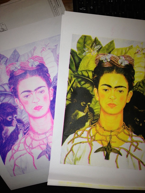
"CMYK" riso printing
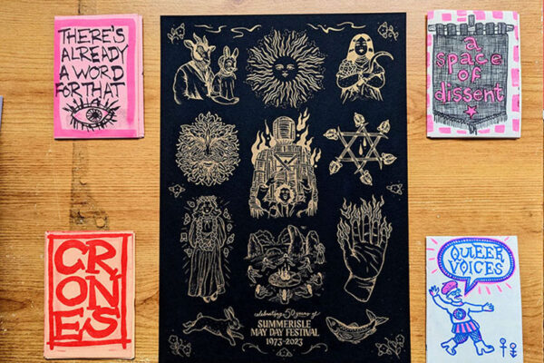
You can split your full colour images into four colour channels, then export each one as its own greyscale image. Not technically CMYK (BPYK), but it is pure magic. Check out this print of Frida Kahlo’s Self Portrait With Necklace of Thorns from 1940. We hope she’d have liked it.
How to send your work
Please use a file transfer site, rather than attaching your files to emails. What we’ll ask from you:
each layer to be black and white/greyscale – even if you are ordering a colour print
pdf is our preferred file type
ensure it is the correct size (ie A5, A6, etc)
include the intended colour of the layer in the filename (eg. autumn leaf orange.pdf)
it’s useful for us to have a mock up of what you hope the finished print will look like (or if it’s been printed before, posting us a copy can be really useful) – but this isn’t an essential requirement
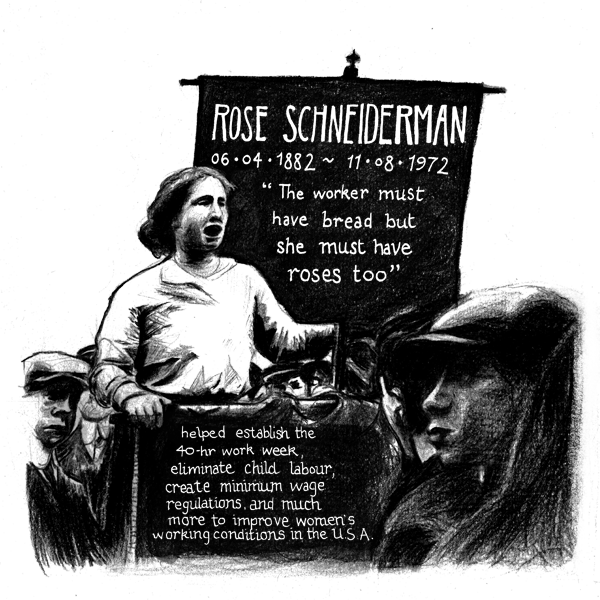
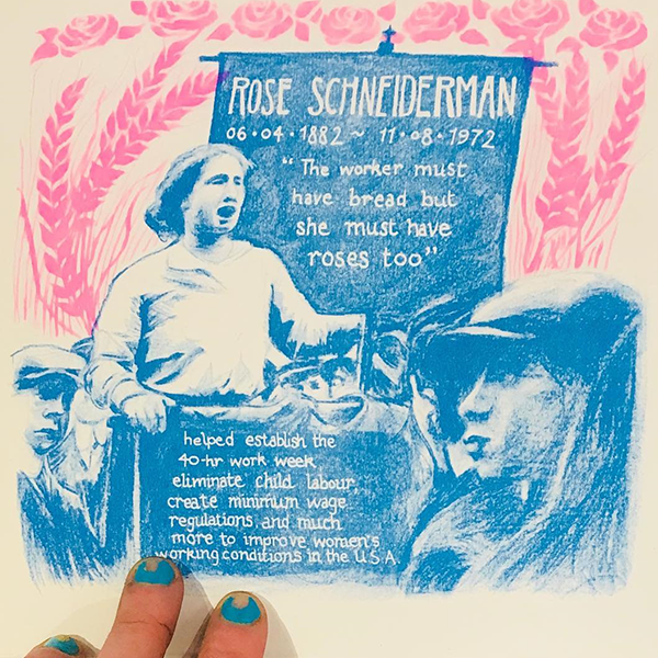
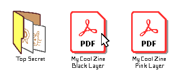
Rose Schneiderman Blue Layer
Rose Schneiderman Pink Layer
Rose Schneiderman final print
zines, margins, bleed requirements
if it’s a zine/booklet, please send one pdf (per colour) made of single sequential pages (not spreads or printers pairs) and include page numbers if that’s what you’ve been quoted for
if you’ve been quoted for at least 5mm clear margins, please ensure that there are at least 5mm clear margins
if your design is full bleed, please ensure there is at least a 3mm bleed area, with crop marks, and that any important information is at least 5mm in from the cutting edge
What's 'eco-friendly' about it?
Riso printing history starts way back in 1946 in Tokyo, when the founder of the Riso Kagaku Corporation, Noboru Hayama, established a mimeograph printing company called ‘Riso-sha’. Riso Ink was Japan’s first emulsion ink, launched in 1954. The thermal stencil master making device that we know today was launched in 1967.
But what makes Riso printing an “eco-friendly” printing process? This is a more complex question than it might first appear, but here are some aspects of riso printing that set it apart from other modern printing technology:
Meet the risographs
The RZ 970E
This little powerhouse has one drum, so just prints one colour ink at a time. We bring the RZ out with us when we’re out for a riso workshop or ZIAD (read more about these here).
Both risos have a handy scanner on top, but we tend to only use this while we’re out and about, or if artwork is sent to us as ‘hard copy’ rather than a digital file. There are more chances of making pagination and margin mistakes when using the scanner, so we’re much more comfortable sending from the computer on a day-to-day basis.
fun fact: the RZ can churn out 150 copies per minute!
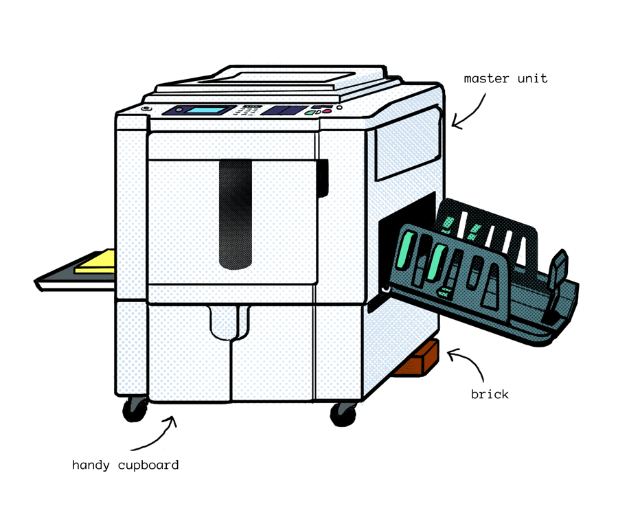
The MZ 970
This is our big beast two colour printer. The basic structure of the machine is just the same as the RZ, but with added capacity for an extra drum. It can’t print quite as fast as the RZ (only 130 copies per minute lol), but this machine is invaluable for getting good registration between two colours.
As you might guess from the labelled picture, this machine doesn’t get moved around very much. It is extremely heavy, and at some point we managed to break off one of the back wheels on the cupboard-podium, hence the brick.
This website uses cookies to improve your experience. We'll assume you're ok with this, but you can opt-out if you wish.AcceptRead More
Privacy & Cookies Policy
Privacy Overview
This website uses cookies to improve your experience while you navigate through the website. Out of these, the cookies that are categorized as necessary are stored on your browser as they are essential for the working of basic functionalities of the website. We also use third-party cookies that help us analyze and understand how you use this website. These cookies will be stored in your browser only with your consent. You also have the option to opt-out of these cookies. But opting out of some of these cookies may affect your browsing experience.
Necessary cookies are absolutely essential for the website to function properly. This category only includes cookies that ensures basic functionalities and security features of the website. These cookies do not store any personal information.
Any cookies that may not be particularly necessary for the website to function and is used specifically to collect user personal data via analytics, ads, other embedded contents are termed as non-necessary cookies. It is mandatory to procure user consent prior to running these cookies on your website.